
|


|
 |
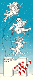
Once upon a time, in a very tiny room in the back of a loft near the corner of Sixth Avenue and Eighth Street in Greenwich Village was Manhattan Design. Although this design studio had a very established-sounding name (you could just imagine seeing it listed in the Yellow Pages) it was kind of a joke. They were just starting out and chose the name to fool potential clients into thinking they had been around for a while. Crammed into this tiny room were three desks and chairs, a stat machine, flat files, some telephones, art supplies and three young graphic designers; Pat Gorman, Frank Olinsky and Patti Rogoff. They didn’t have much experience or money, but they sure made up for it with spirit and creativity. This was BC – before computers – and everything they designed was done with very simple tools: markers, ink, xerox copies, and photostats. They weren’t famous and they didn’t know anyone famous, but somehow they managed to earn a living. One day, Fred Seibert a friend of Frank’s from early childhood – when they used to hang out at the school bus stop and look at comic books, etc. – called him about a project. Fred was working for a big corporation, Warner Amex, who was planning a 24-hour music cable television station. He said they didn’t know what they would be showing but they were going to have to fill 24 hours, 7 days a week with it. In those days there weren’t any rock videos as we have come to know them, mostly short performance films. They were entering uncharted waters without a compass. Fred said they needed a logo designed for the station. He said that some top established designers had already been hired but he had squeezed some additional money out of the corporation to give these young upstarts a shot. Pat, Frank and Patti began doing many sketches. Lots and lots of them. Their earliest ideas featured notes and other obvious music symbols. These were quickly dismissed. What happened next is a bit blurry but some specific details have survived. They made some sketches featuring the letters “M”, “T”, and “V”. Some of these sketches included Mickey Mouse-like hands squeezing the notes. At some point an outline drawing of a bold sans serif “M” appeared on a piece of paper. One of the three designers then drew dimensional sides to the “M”. After that a variety of groupings of the letters “TV” were added. Everything seemed too normal-looking. Frank suggested that the logo needed to be less corporate somehow, de-faced or graffitied. Frank used to watch Winky Dink when he was a child. Winky Dink was actually the first interactive TV. During the cartoon episodes of this, various parts of things were left undrawn and the main character Winky Dink, who was a cute little fellow with a star-shaped head, would run into trouble and crayon-wielding viewers were asked to help him out at key moments by filling in the missing parts on a special clear plastic film that was placed over their TV screens. Frank was oftentimes so excited about all this that he forgot to put the special film on his parents TV screen thus leaving waxy evidence. He took an enlarged copy the fat “M” drawing and went into the narrow stairwell with a piece of acetate and a can of black spray paint. The next thing you knew the now famous “TV” lettering appeared. The three designers then played around with the scale and proportion and after some tweaking arrived at the MTV logo pretty much the way it appears today. The sketches were sent up to Fred and he presented them to the various “suits” involved in choosing the logo. (Pat, Frank and Patti never attended these meetings so they could only speculate what went on.) The story goes that the sketches actually ended up in a Warner Amex wastebasket several times and was reconsidered. Now is that rock’n’roll, or what? Fred sent the sketches back to Manhattan Design for refinement. Things like putting MUSIC TELEVISION under the big “M”. Soon after the logo was approved. The next, and probably most revolutionary part of the story came when they were asked to come up with the “corporate colors” for the logo. The decision was made that there weren’t any, and that the logo should always change. Knowing that many animators, designers, ad agencies, etc. were going to be working with the logo made them think how, just like rock music always changes, the logo should also. This was a concept that had never been used on a logo before. The “M” and the “TV” could be made of any colors and/or materials. The rest is history. Sometimes Frank thinks about those days and it seems like another lifetime. |
  |


|
|
|